Life Is Full Of Important Choices!

Young designers Dora Budor and Maja Čule need no particular announcement. In a neoliberal era of capitalism rare is the designer who will opt for brand subversion and disengagement from established paths. Budor and Čule chose the road less traveled but certainly more critically aware – opting for the direction which emphasizes the author’s signature. Whether they’re designing the Student Center’s program, posters for the &td Theater shows, flyers for the Sirup Club, or are collaborating with the fashion brand Roba, their work is always recognized, proving that it’s possible to make a name for oneself working for non-profit organizations and in the field of independent culture. Still, the designers don’t strictly adhere to the anarchist questioning of design but tend to bring their own particular style to life – “anarcho-chic” as they call it, a slightly playful, witty visual language toying with queer and Kemp.
They made a name for themselves with their amazing 2007 Duties Free Store Project where they took a critical attitude towards The School of Design’s profile by transforming the Faculty’s entrance (which is at the same time a glitzy high-end retail chain) into a hypertrophic supermarket in an attempt to voice their personal dissatisfaction with its educational program.

Then the awards started pouring in: several Magdalenas, the 40th Zagreb Salon Award, Zgrafa, as well as the prestigious New Visual Artist Award awarded by the American magazine Print. Maybe that was the catalyst or maybe it was just the natural flow of things for them to continue their postgraduate studies in New York with Steven Heller, in a program with clearly defined guidelines – “The Designer as Author“. And when Stefan Sagmeister himself recommends you for designing the Wallpaper’s cover, then you know it’s a sure sign that your life choice of moving to New York was spot on and that you’ve got it made.
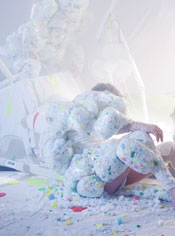
And last but not least, the dynamic duo Budor + Čule are currently exhibiting their second American exhibition entitled “Life is Full of Important Choices”. The title stems from a commercial for various types of beer, but it’s been reformulated into a catchphrase describing everyday objects that have the same function while differing in appearance. Creating upside-down narratives and constructing reality, the designers bring objects into a new context taking any and all palpability from them. In their work the absurd and mysterious comes both from Freudian “discomfort” as well as from run-of-the-mill things you might find in your own fridge. Despite Dora and Maja being each their own individual, when combined, their work is crafted into one harmonious stream of eccentrically inspiring consciousness.
Without further ado, their work can be summed up as provocative and witty.

The designers ceded the photos of their exhibited works, for all those who won’t get the chance to visit the Exhibition in Brooklyn, open from January 22nd through February 12th.

Photographs: Dora Budor & Maja Čule


